Case Study
CashApp: UI/UX Conceptual Feature Design

How might we help CashApp users split bills between three or more people as efficiently as possible- while ensuring accuracy and fairness?
CashApp is an app from Block, Inc. that allows users to make person-to-person (P2P) payments using a mobile device. One of the significant uses of P2P payment apps is for a group of people to pay back a bill that one person paid for. By adding a split feature to make splitting payments easier for things like restaurant bills and utility bills split between three or more people, CashApp could gain more users making more transactions.
Note: I created this design as part of my University of Wisconsin UI/UX Bootcamp coursework- not as a CashApp employee or contractor.
My Roles
UX Researcher/Designer, Copywriter
Tools
Figma, FigJam, User Interviews, Persona, Task Flows, Usability Testing
Time Frame
3 Weeks
Collaborators’ Roles
UX Researcher/Designer, Project Manager, UI designer, Prototyper
Process
As a full-time innovator and occasional street performer, I think of the design process the way I think about juggling.
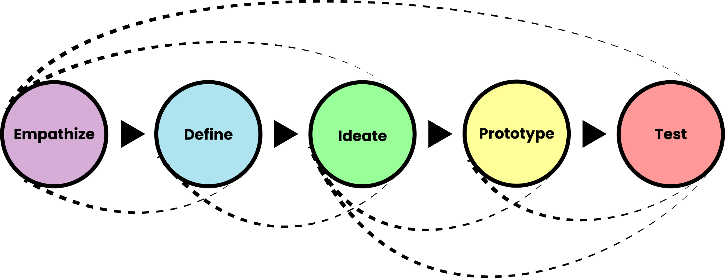
You have to plan and practice your throws to know where the balls are headed in order to catch them.
But occasionally you have to improvise. Maybe a passerby is walking and texting, and you realize you have to redirect your focus to keep them from crashing into you.
In the same way, every step of the design process brings new discoveries, and sometimes you have to revisit a few steps of the cycle before getting back into a familiar groove.
Understanding how people split bills
Competive Analysis
We compared CashApp with other leading P2P apps: Venmo and Zelle
Strengths
Sleek minimalist aesthetic
Efficient payment flow
Weaknesses
No current feature for splitting money with a group
less name recognition and market share than Venmo.
Minimalist aesthetic comes with a tradeoff when adding new features: How can we change the flow without cluttering the clean space?
Opportunities
Adding a split feature might draw users who primarily use P2P apps (especially Venmo) to split social bills like restaurant checks.
Relationship with Square could be leveraged to make it easier to divide payments to vendors who use the Square platform.
Interview Goals: Find out…
How people feel when splitting “social” and utility bills.
How people split bills
Pain points users may be facing when splitting a bill.
Sample Interview Questions
Do you use any apps that let you pay money to other people?
If so, what is your preferred app?
If so, how often do you use your cash app?
If not, why?
When it comes time to split the bill at a restaurant how do you feel?
How do you normally go about finding who pays what (both: utility/restaurant/night out)?
Threats
Venmo is the dominant competitor currently. Users consistently use the phrase “Venmo me” when discussing mobile P2P payments.
Zelle is packaged with users’ banking apps, which may make it a default for some users.
User Interviews
Competitive Analysis Insights:
CashApp walks the balance between the buttoned-up, bank-operated functionality of Zelle, and the social media-fueled Gen Z energy of Venmo. It’s sleek and efficient, and any added features need to honor that expectation.

Interview Findings
The tip on a restaurant bill often gets lost or shorted when the bill is split.
A lot of people find it easier to split a restaurant bill evenly to avoid the hassle of sorting out exact totals (“Just so it doesn’t get like, ‘Who got the side of ranch?’” said one user). But they also note that this method isn’t fair when there’s a disproportionate amount spent.
For the use case of utility bills, it definitely makes sense for the group to pay back one person- the bill is specifically in their name.

Interview Insights
Users feel that splitting a bill by item is too complicated to bother with on the fly. For a social setting (like a restaurant), the feature would need to be quick and easy to use.
Many users tend to use Venmo rather than CashApp. Requiring an app download in the middle of the chaos of settling a bill could be a barrier to the feature’s success in a restaurant environment.
The feature could be helpful for people who plan trips or other events where different kinds of expenses (e.g. Lodging, dining, tickets, etc.) are shared. This might incentivize the planner to ensure all members of the group have the app ahead of time.

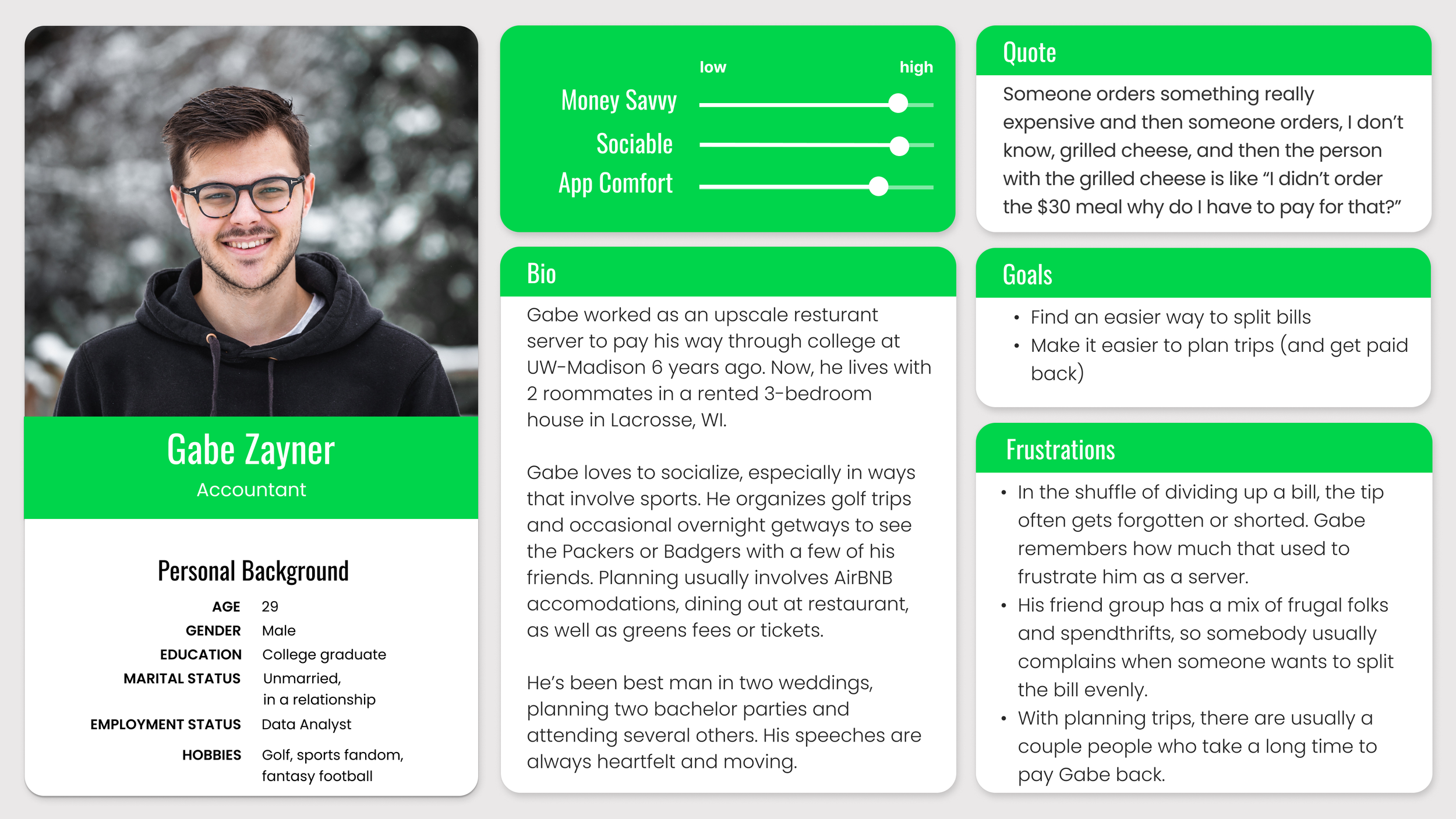
Who is the user and what do they need?
User Persona
I created a persona based on users who had the most at stake when it comes to making it easy to get paid.
Meet Gabe. He’s the social planner for his friend group.
Gabe makes the plans and reservations, and he’s going to convince his friends to hop on a platform that makes it easier for him to get paid back.

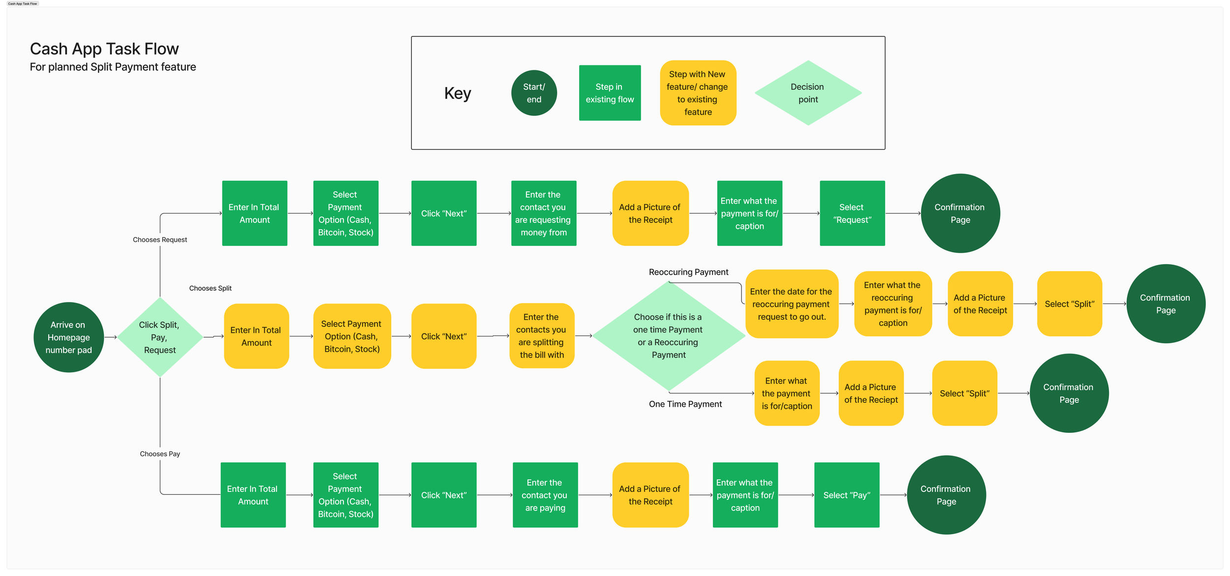
Imagining Task Flows
CashApp thrives on its streamlined user experience, so we didn’t want to add too many steps. Using the existing flows for Pay and Request, we thought through the simplest “happy-path” Task flows we could imagine for Request/Pay/Split and Recurring/One-time payment. This gave us a road map for our first prototype.

Low Fidelity Sketch

Making a mess + making discoveries
Sketching low-fidelity wireframes helped our team align on some big ideas about flow and layout before committing to a full prototype. We also discovered some needs and challenges that weren’t obvious when we devised our task flow.
Auto-Scan Simplicity
Itemization needed to be quick and easy. We included a feature for auto-scanning a receipt photo.
Who Got What?
We needed a quick way to assign items to people in the group. We identified a dashed-line circle as a UI element that could quickly be replaced by a user’s profile bubble with a couple taps.
Keep It Editable
Photo scanning tech is great, but not perfect. We’d need a way to edit or manually enter itemization to help users control their experience.
Sum It All Up
An itemized transaction needs more detail on the confirmation screen than existing CashApp transactions. We needed to build a fresh layout- but not stray too far from the existing format.

First Usability Test: Mid-Fidelity Prototype
Could real humans use this feature to split a bill?
We created an interactive prototype in Figma, then gave testers an open-ended task to complete:


Users felt a mismatch between using a photo scan of the receipt to get all the information but still having to enter the total before taking the photo.
In order to follow the logical flow of the existing site, and for users to easily discover it, the Split option needed to be available directly from the number entry screen. We replaced the “Pay” and “Request” CTA buttons with the 3-part toggle at the top to prevent errors- especially since the feature was new.
The first version of the transaction detail screen (See left) had 2 ways to add people to a split, which slowed users down as they tried to figure it out.
The Task
"You went to Carrabba's with three friends, and you put it on your card. Now you want to split the bill with CashApp. You have the receipt with you so you can divide up the cost by who got what."
Our Next Challenge:
Users wanted to start with the receipt scan. This created a new flow- but we needed inputs from the original flow in order to complete the transaction. In our first attempt, users could skip vital steps and still end up on the confirmation screen.
How could we account for users’ choices of how to navigate the app while seamlessly gathering the information needed for the transaction?
Users liked the simplicity of tapping an item to assign it to a group member.
A New Call to Action
Reducing Confusion
Why Do Twice The Work?
A Small Success

We removed the redundant “Add Members” section. This opened up space for manual item entry options- including the “Add tip” feature (see right).
Redundant!
Useful!

Iteration Time: Revised Wireflows

Starting with a receipt photo seemed like an obvious win for users, but it came with a few design challenges:
We needed to fit a receipt photo UI icon into the sleek number entry screen.
The receipt photo created an alternative to the number pad for entering a total, but it needed to fit logically into the same flow.
The tip is usually not included on the receipt, so we’d need to add it in a separate section.
Some users would still want an even split option.
An algorithm could scan receipt items, but users would still need to enter contacts and other transaction information separately.
We copied our wireframes into Figjam, which gave us the freedom to duplicate frames and scribble on everything as we worked out all the paths that users might take through different use cases.
Challenge: The receipt photo created an alternative to the number pad for entering a total, but it needed to fit logically into the same flow.
Solution: Display the auto-scanned total in the number entry screen along with a mini-photo of the receipt. Then continue the normal flow for split, pay, or request.

Challenge: We needed to fit a receipt photo UI icon into the sleek number entry screen.
Solution: The receipt photo icon fit neatly next to the existing code scan icon- with room for helper text announcing the new feature.
#1
#2
Challenge: The tip is usually not included on the receipt, so we’d need to add it in a separate section
Solution: The Itemized option includes an Add Tip dropdown.
#3
Challenge: Some users would still want an even split option.
Solution: The transaction input screen includes a Split Type dropdown, with Itemized and Even Split as options.
#4
Challenge: An algorithm could scan receipt items, but users would still need to enter contacts and other transaction information separately.
Solution: Our improved flow ensured that users would reach the transaction information screen before itemizing the scanned receipt.
#5
Bonus Discovery: Review and Retake photo options could give users more control
Entering High Fidelity: Style Guide
The team didn’t have access to CashApp’s internal brand guide, so we built a style guide for the project based on their publicly available marketing assets and screen shots of the app.
I took charge of defining colors and usage.

CashApp’s green-and-white minimalism masks a wide range of subtle color variations. I explored every screen in the payment flow to identify each color and its purpose. Then I pulled screen shots into Figma and drew the hex codes from there.
We had a stretch goal to include light and dark mode versions of our prototype, so I gathered information on both color sets. In the end, we only had time to mock up the classic Light Mode version.
I set each color as a preset style in the team’s shared Figma file for quick access. I named each color based on its function for quick recognition.

High Fidelity Prototype
The Scenario: Dinner went on your card, and now it’s time for everyone at the table to settle up. Scan a photo of your receipt to set up an itemized split. Then just enter transaction information, tap items to assign them to other users, and make the request.
Photo Scan to Itemized Split
Figma brings it all together.
Takeaways
Lean on Me
When we began, each team member identified specialties in 2-3 of the project’s core needs: Writing, Graphics, Research, Planning, and Prototyping.
This allowed us to take ownership of tasks by specialty (for example, creating different aspects of the style guide), but also made the team versatile enough to come together when a task was too big for one or two team members to complete quickly (for example, when laying out components from the style guide into prototype screens).
Beyond its role as an academic exercise, this project provided a great insight into the rhythms of Lean and Agile practices.
Here’s what I learned:
Not quite Agile, definitely nimble.
What can I learn about the Agile UX process without the designer-developer relationship that defines it? A lot!
Even though we weren’t working with real-life product release cycles, the agile structure of sprints was baked into our process of designing, building, and testing. The scope of the feature was just right to explore in a three-week sprint.
One challenge that might not hold up to the real-world development cycle: I love the idea of our receipt scanning feature, but I also understand that it would pose a much greater development challenge than waving a magic Figma design wand. Probably not a feature that could be released in three weeks without a dedicated image processing team already in place!