Case Study
Theater for Young Audiences: Visual Re-brand

How might we use visual branding to engage a theater community?
Theater for Young Audiences is a non-profit youth theater company in Sheboygan, WI. Its mission: “To educate children about themselves and the world around them through theater.” For nearly 35 years, TYA has brought delight to young people and their families through performances, workshops, and other community events.
Now in its 35th year, TYA faces a new landscape as it shares its work with the community. Its beloved founder retired in 2016, newer companies in the area began to grow, and the 2020 Pandemic threw live performance everywhere into uncertainty. A new visual identity could help put a spotlight on the value TYA brings to Sheboygan.
Note: While I have worked as a stage director and circus skills instructor for TYA, I created this design as part of my University of Wisconsin UI/UX Bootcamp coursework- not as a TYA employee or contractor.
Roles
Brand Guide, Logo, Color, Typography, Layouts
Tools
Illustrator, InDesign, Pen+Paper
Time Frame
5 Weeks
Process
As a full-time innovator and occasional street performer, I think of the design process the way I think about juggling.
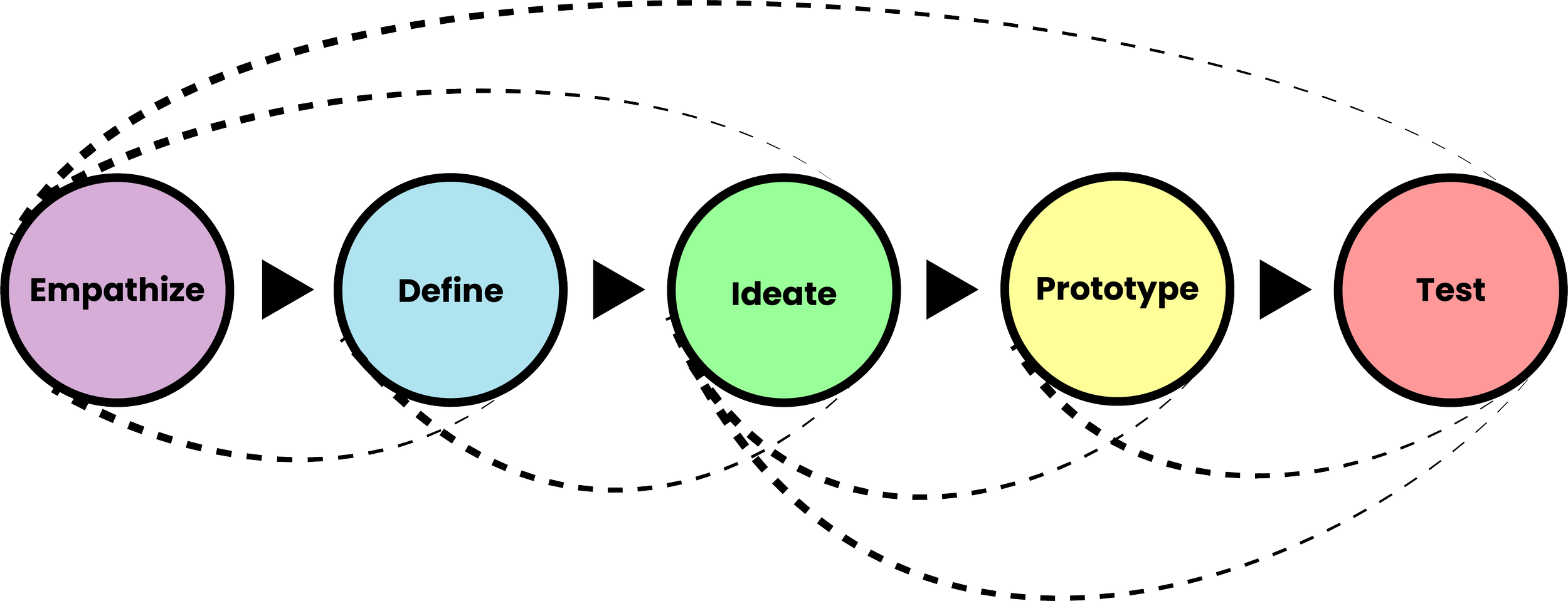
You have to plan and practice your throws to know where the balls are headed in order to catch them.
But occasionally you have to improvise. Maybe a passerby is walking and texting, and you realize you have to redirect your focus to keep them from crashing into you.
In the same way, every step of the design process brings new discoveries, and sometimes you have to revisit a few steps of the cycle before getting back into a familiar groove.
Empathize: Understanding TYA’s needs and values
Values
Two generations of Tradition
Many adult participants got their start performing or seeing TYA plays as children.
Focus on Education
TYA built its talent base with process-based educational work. Giving students the opportunity to act, direct, and design plays helps everyone find their place and expands skills for the whole community
Joy and Fun
This is what draws people into TYA’s auditions and box offices. People want to have fun together, whether it’s rehearsing a play or watching one.
Needs and Community Context
As a teacher and theater artist, I had been involved in a lot of discussion about the local theatre scene in Sheboygan, WI. Sheboygan boasts a surprisingly vibrant theatre community for its size (about 48,000 residents in the city, and 115,000 in the whole county). Audiences can choose to see productions from a large community theatre, 2 youth theatres, 2 local universities, several local high schools, and a variety of independent projects and professional touring productions. While each group has a core following of participants, many actors and volunteers work with several organizations.
While groups make an effort to coexist peacefully, they do encounter some competition for participants and audiences. As the community grows, each group is defining its own brand and niche.
Define
Defining the goals for TYA’s brand identity came in 3 parts:
Identifying the audience
Who needs to see the branding and take action?
Identifying users
Who needs to create branded materials?
Competitive analysis
How do other local theaters show brand identity?
Audience
Potential participants
Typically children ages 8-18 and their families
People coming to see shows
Typically ages 4-18 and their families
Donors
Many donors are current or former participants
Users
TYA Staff
Small team, often with a lot on their plates
Parent volunteers
Varied skill levels and interests, but high availability as volunteer hours are required for participation
Freelance graphic designers
Available for larger projects, but not for everything
Competitive Analysis

Discoveries:
Several other companies use very similar monochrome blue palettes
Stars and organic human forms with arms outstretched also appear multiple times
Opportunities:
A well-balanced triadic palette would stand out in a local lineup
Other logos carry minimal information about values. TYA’s logo could highlight its unique offering to the community
Goals for new logo:
Fun for a kid to draw on a notebook
Looks good in white on a black T-shirt (every show has a shirt)
Use balanced, bright colors
Show what makes TYA special
Community of actors and audience
Multiple generations working together
Joy and fun
Ideate: Auditioning the Visuals
The cornerstones of any visual brand are the logo, color palette, and typography. I generated as many ideas as possible for logos, 60/30/10 triadic color palettes, and font options for headings and body text.
Logo Sketches
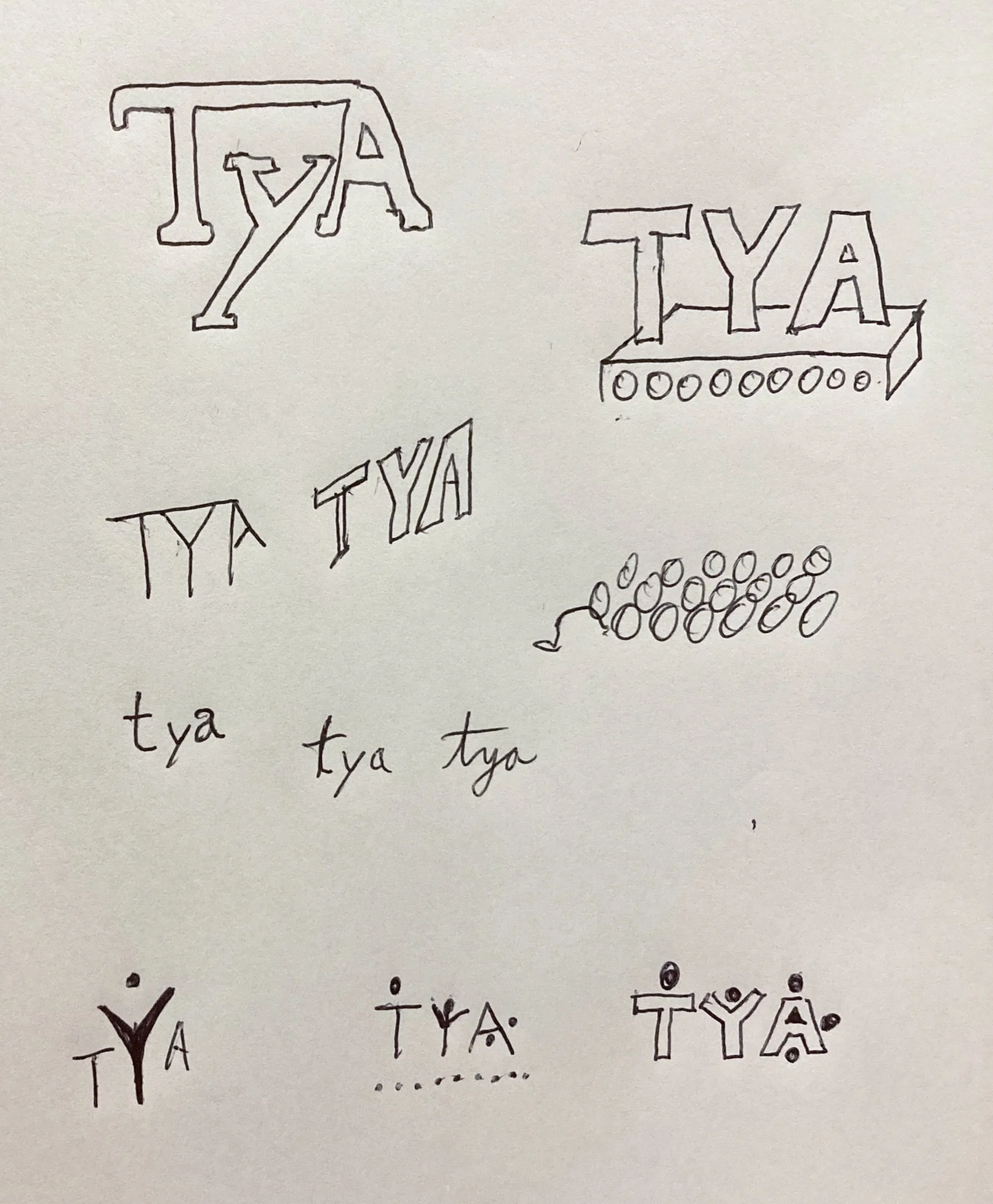


“Auditioning” typefaces and color palettes


Prototype: Building the brand guide
The elements in the logo bring the onstage participants and audience into focus and emphasize that the organization has a strong connection to the people who take part in it: Inter-generational participants and young audiences alike.


Focusing on the Users
When users haven’t used a brand guide before, it’s important to explain what it’s for and how it works. This is also a great space to introduce the tone of voice for branded writing.
Jost and Fraunces are both freely available Google fonts, making them easily accessible to most users
Decorative Elements
I created sample geometric elements as models for branded materials. Since people without design training might be called upon to use the branding, I wanted to make it easier to make good-looking visuals.
Creating the Logo
Earlier Iterations
In this version, I tried to show grown-ups helping a young actor. But it felt flat and failed to show the child’s role as an equal partner in the work.
This version added a sense of depth on the stage with the youngest actor front and center, but the audience seemed too serious in that straight line. The final version features a more dynamic static audience.


Test: Putting the visuals in context
The first test of visual branding: Can you make stuff with it?


Social Media Ads


Posters
The posters build on the imagery from the online ads. The registration information is marked with a heading that echoes the button in the digital version of the ad. The posters use repetition of the same logo header and contact information footer to provide consistency.
The Facebook ads came second, with all but the most vital information stripped away. (Typically this comes in the post’s caption text or after clicking the link). I added visual character to each event to help make each one distinct. Each ad features the same placement of the logo near a large yellow “Sign Up” button as a call to action.
Trifold Brochure
I created a trifold brochure first, to generate content that could be copied into the other deliverables. Workshops and classes are an important on-ramp to bring new people into TYA, so I created sample deliverables for several fictional workshops similar to TYA’s past offerings.

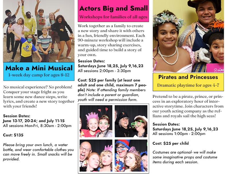
Inside of Brochure
Outside of Brochure
*Photos used in sample marketing deliverables come from TYA’s Facebook page.
Takeaways
The process of creating this project helped me develop some key elements of my design sense:
Simplicity can go a long way
White space is my friend
Triadic color schemes can be vibrant, but also unwieldy. 60-30-10 balance helps them function more attractively.